Enboarder — Activity Dashboard
UI, Design System
Background
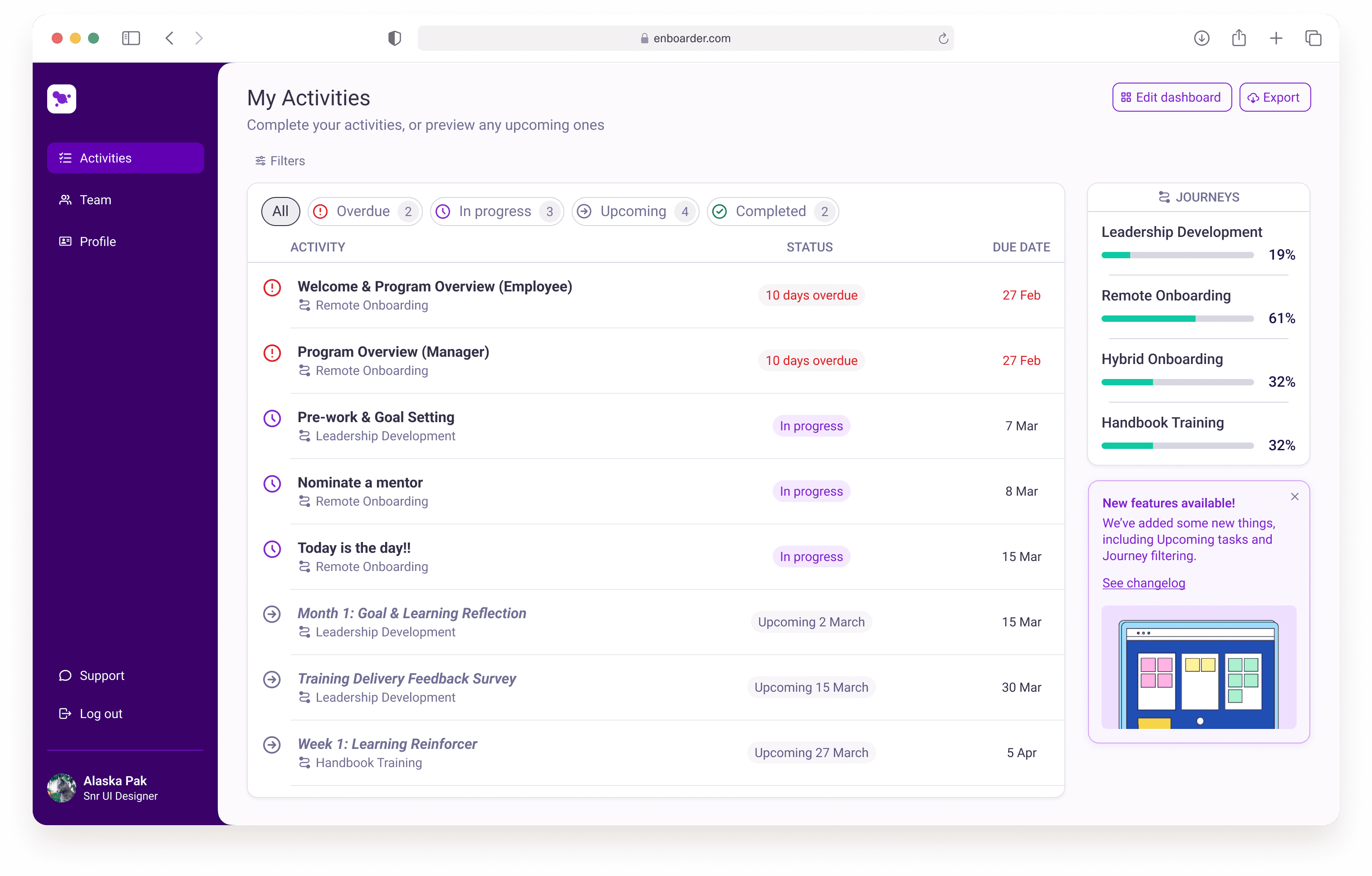
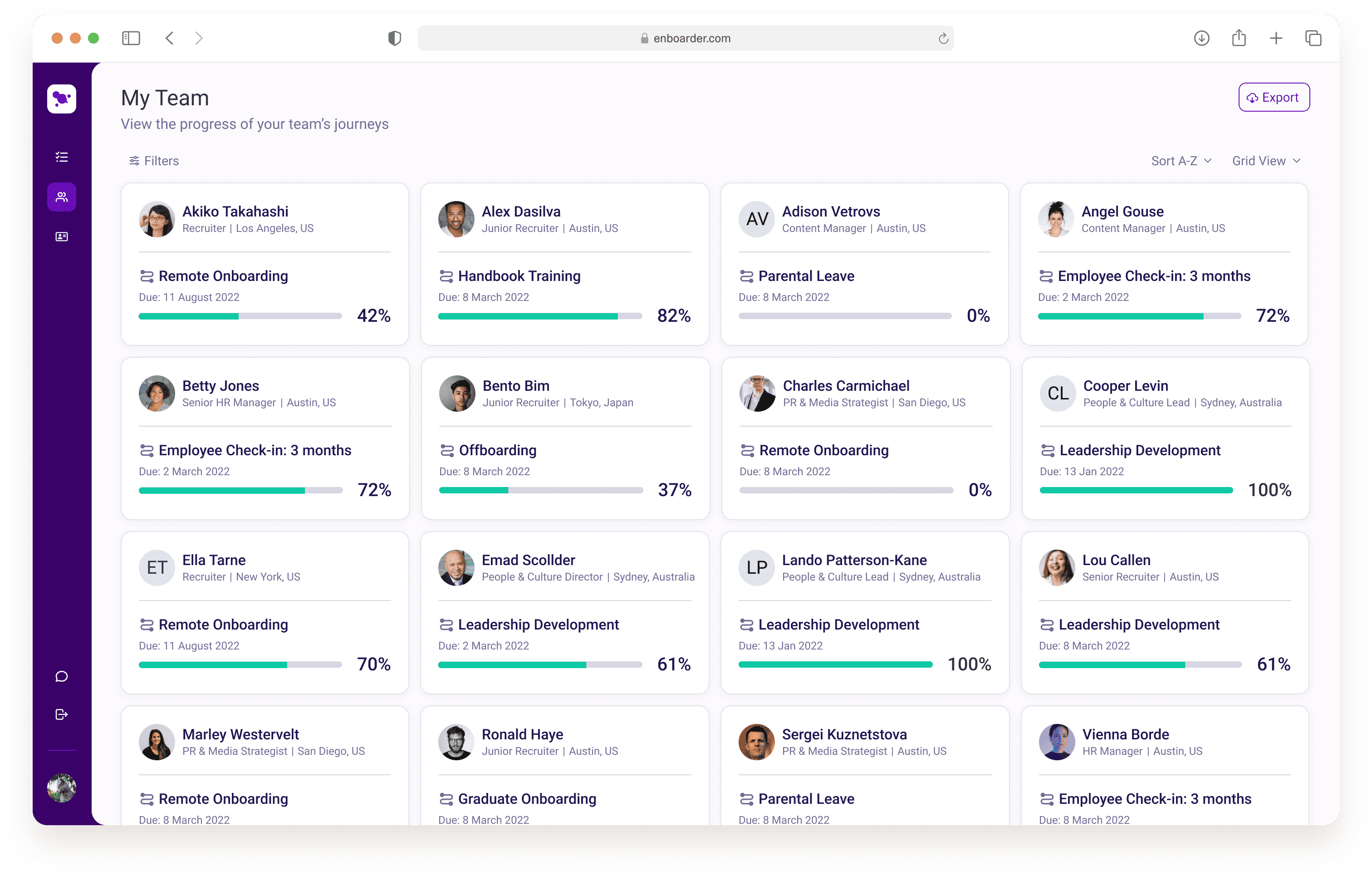
Enboarder’s activity dashboard is a place where both managers and employees can have an overview of all of their tasks. They can action overdue tasks, complete what’s in-progress, and get a glance of anything upcoming. Managers have the additional view of their team’s progress against their activity list. Working on this feature was a unique challenge, as it was multiple years in the making, and had seen multiple UX designers over the years before it reached my desk.
Process
My primary responsibility was to give the feature a UI facelift, and collaborate with engineering to bring it to life, without vastly altering the approved structure. Given that I was simultaneously working on the build of the design system, this was a great opportunity for me to test out the components that I had built within the shortest feedback loop. Collaboration with the UX researcher was integral to the post-discovery phase in order to align the UI with existing insights, allowing for the update to not only look appealing but address all user stories effectively.
Challenge
Since this was essentially a white-label feature, one particular challenge we faced was incorporating customer theming as seamlessly as possible. We needed end-users to feel like they were still in their company’s ecosystem when using our platform. We were able to generate a set of colour shades based off the account’s brand settings (set within the Admin platform), and link those colours to the same tokens that were used within our components, allowing elements like buttons, links, and focus states, to maintain the brand’s essence.
Date: